You’re scrolling through social media, and an ad catches your eye. The colors pop, the design feels familiar yet fresh, and before you know it, you’ve clicked. That’s the power of a great logo; it doesn’t just look good, it works.
But here’s the thing: Most businesses underestimate their logo. They think it’s just a “nice-to-have,” something to slap on a business card and forget about. Big mistake. A logo isn’t just a pretty symbol; it’s your first handshake with customers, your silent salesperson, and the cornerstone of your brand’s identity.
Let’s talk about real businesses, not just the Apples and Nikes of the world, but local cafés, startups, and freelancers who saw real results after investing in a custom logo. We’ll cover:
- How a logo builds instant trust (and why generic ones fail)
- The hidden psychology behind colors and shapes
- Real stories of businesses that transformed with a logo redesign
- Where most people go wrong (and how to avoid it)
- How to get a logo designed without the stress
By the end, you’ll see why skipping a custom logo is like opening a store with the lights off—people might walk by, but they won’t come in.
A Logo Isn’t Just a Picture—It’s a Promise
First Impressions Aren’t Just Important, They’re Everything
You’ve heard it before: “You never get a second chance to make a first impression.” But here’s what most people don’t realize: that first impression isn’t made when someone reads your about page or scans your services. It’s made in less than a second, the moment they see your logo.
Think about the last time you googled a local service. Maybe a plumber, a bakery, or a gym. Which listings did you click on first? The ones with clean, professional logos, or the ones that looked like they were made in Microsoft Paint in 1998?
People judge books by their covers, and businesses by their logos.
A well-designed logo tells customers:
- “We’re professional.”
- “We care about details.”
- “You can trust us.”
A bad logo (or no logo at all) sends the opposite message.
The Psychology Behind the Design
Ever wonder why fast-food logos use red and yellow? Or why banks love blue and gray? It’s not random, it’s psychology.
- Red = Energy, urgency (great for sales, food, or fitness brands).
- Blue = Trust, stability (perfect for finance, healthcare, or tech).
- Green = Growth, health (ideal for organic products or wellness brands).
- Black = Luxury, sophistication (used by high-end brands like Chanel or Tesla).
Shapes matter too:
- Circles feel friendly and inclusive (think Target or Starbucks).
- Squares suggest stability and trust (like Microsoft or American Express).
- Triangles imply power and dynamism (as seen in logos like those of Adidas or Delta).
A custom logo leverages these principles to connect with your audience on a subconscious level.
Case Study: The Bakery That Doubled Sales with a Logo Redesign
Let’s talk about Sweet Delights, a small bakery in Portland. For years, they used a clip-art cupcake as their logo. It was cute but forgettable, and their sales reflected steady, but not growing.
Then, they invested in a custom logo: a hand-drawn cupcake with a modern twist, paired with warm, inviting colors and a clean, readable font. The result?
- Social media engagement increased by 150% (people shared their logo more often).
- Foot traffic grew by 40% (customers said the new logo made the shop look “more professional”).
- Online orders doubled (the logo was memorable enough that people recognized it in ads).
All from a single design change.
Why Generic Logos Are Costing You Customers
The Problem with “Good Enough”
Too many businesses settle for “good enough” when it comes to logos. They use:
- Free logo makers (like Canva or Looka).
- Pre-made templates from Fiverr or 99designs.
- A cousin who “knows Photoshop.”
Here’s the hard truth: Generic logos don’t work because:
- They look like everyone else’s. (If 100 businesses use the same template, how will yours stand out?)
- They lack personality. (A logo should reflect your brand’s unique story—templates can’t do that.)
- They’re not scalable. (Ever seen a logo that looks great on a website but blurry on a business card? That’s a template problem.)
The Hidden Costs of a Cheap Logo
Skipping a custom logo might seem like a money-saver, but it costs you in the long run:
- Lost customers who assume your business is unprofessional.
- Rebranding expenses when you finally upgrade (which always costs more than doing it right the first time).
- Legal risks if your logo accidentally copies someone else’s design.
Example: A local gym used a free logo that looked suspiciously like a well-known fitness brand’s. They received a cease-and-desist letter and had to rebrand mid-campaign, costing them $5,000 in lost marketing materials.
A custom logo is an investment—not an expense.
Need a Logo That Works? If you’re ready for a custom logo that truly represents your brand, TCU’s design team can help. Get in touch today to discuss your project!
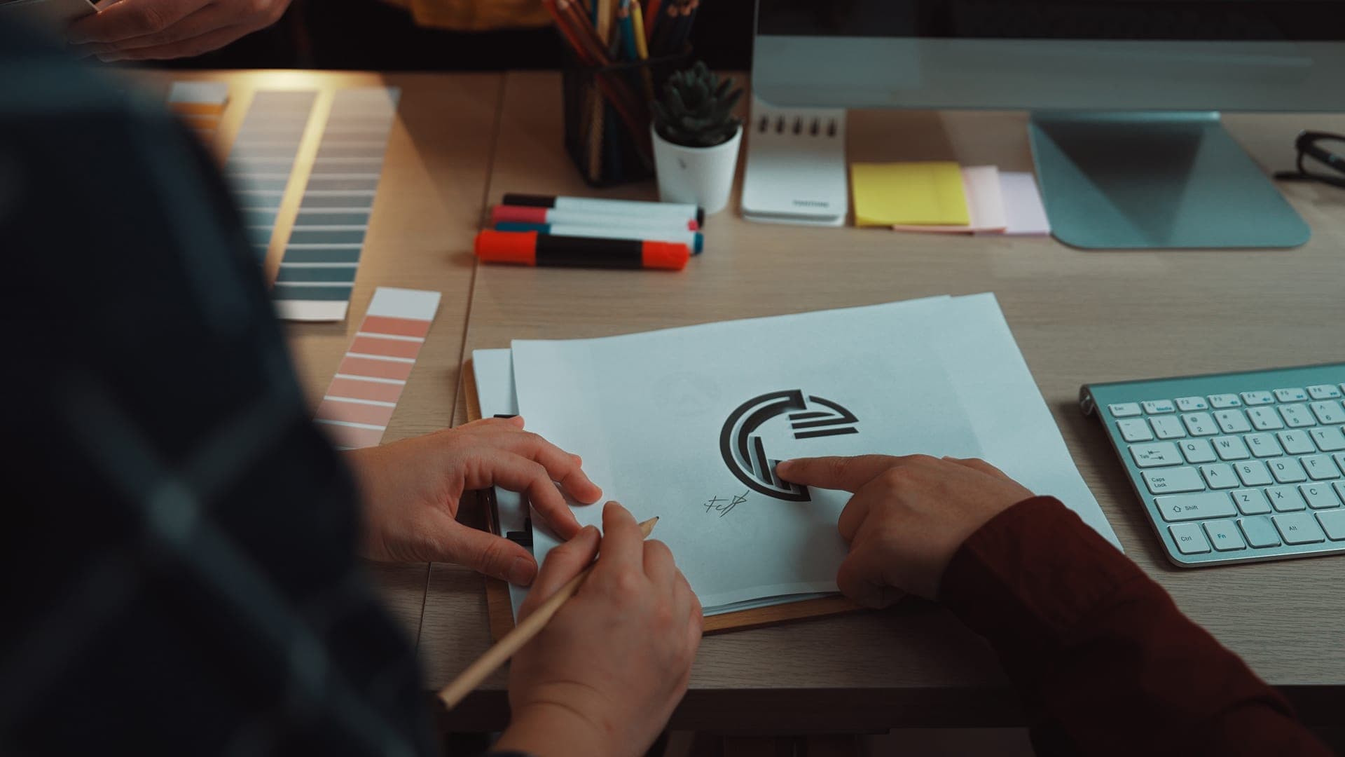
How to Get a Logo Designed the Right Way
Step 1: Know Your Brand Inside and Out
Before you even think about colors or fonts, ask yourself:
- What does my business stand for? (Luxury? Affordability? Innovation?)
- Who is my ideal customer? (Young professionals? Parents? Small business owners?)
- What feeling do I want my logo to evoke? (Trust? Excitement? Comfort?)
Example: A children’s book publisher would want a playful, colorful logo, while a law firm needs something clean and authoritative.
Step 2: Work with a Professional (Yes, It’s Worth It)
You wouldn’t cut your own hair before a big meeting, so why get a logo designed on your own? A professional designer brings:
- Expertise in color theory, typography, and branding.
- Fresh eyes to avoid clichés and overused trends.
- Technical skills to ensure your logo looks great everywhere (from a tiny favicon to a billboard).
Where to find a designer?
- Agencies (like TCU) for full branding packages.
- Referrals from other business owners.
- Freelance platforms (Upwork, Fiverr) for mid-range budgets.
Step 3: Keep It Simple (But Not Boring)
The best logos are simple but memorable. Think:
- Nike’s swoosh (no words needed).
- Apple’s apple (instantly recognizable).
- McDonald’s golden arches (works in any language).
Avoid:
- Too many colors (stick to 2-3).
- Overly complex designs (should look good at 1 inch or 10 feet).
- Trendy fonts (they’ll look dated in a year).
Step 4: Test, Test, Test
Before finalizing your logo, test it in real-world scenarios:
- Does it look good in black and white? (Some printing methods don’t use color.)
- Is it recognizable at small sizes? (Like on a social media profile picture.)
- Does it stand out against different backgrounds? (White, dark, patterned.)
Pro tip: Show it to 5-10 people in your target audience and ask:
- “What does this logo make you think of?”
- “Does it feel trustworthy?”
- “Would you remember it after seeing it once?”
Step 5: Protect Your Investment
Once you have a logo you love, trademark it to prevent copycats. In the U.S., you can file for a trademark through the USPTO website. This legal protection ensures no one else can use your design and dilute your brand.
Where Most Businesses Go Wrong (And How to Avoid It)
Mistake #1: Designing for Themselves, Not Their Audience
Your logo isn’t about what you like; it’s about what your customers respond to. If you’re a luxury brand, a cartoonish logo won’t work. If you’re a kids’ brand, a sterile corporate logo will fall flat.
Fix: Survey your audience before finalizing a design.
Mistake #2: Following Trends Instead of Timelessness
Remember when every logo had a gradient in the 2000s? Or when every startup used a “lightbulb” to symbolize innovation? Trends fade fast. A timeless logo (like Coca-Cola’s or IBM’s) lasts decades.
Fix: Avoid overused symbols (like globes for “global” companies or lightbulbs for “ideas”).
Mistake #3: Skipping the Research Phase
A logo should reflect your industry. A law firm shouldn’t use Comic Sans, and a toy store shouldn’t look like a bank—research competitors’ logos to stand out, not blend in.
Fix: Create a mood board of logos you love and hate—this helps designers understand your vision.
Mistake #4: DIY-ing Without Design Skills
Unless you’re a trained designer, creating your own logo often leads to:
- Poor typography (hard to read).
- Bad color choices (clashing or unprofessional).
- Low resolution (pixelated when printed).
Fix: If the budget is tight, use a reputable freelancer instead of a DIY tool.
Mistake #5: Not Thinking About Versatility
A logo must work everywhere:
- Website headers (horizontal and vertical versions).
- Social media icons (square format).
- Merchandise (embroidered on hats, printed on mugs).
- Black-and-white (for fax, documents, or cheap printing).
Fix: Ask your designer for multiple file formats (PNG, SVG, EPS) and variations (full logo, icon-only, horizontal/vertical).
Final Thoughts:
Your Logo Is Your Business’s Face—Make It Count
A custom logo isn’t just a checkmark on your business to-do list. It’s a powerful tool that:
- Builds trust with customers before they even read a word.
- Makes your brand memorable in a crowded market.
- Saves you money in the long run by avoiding rebrands.
- Works 24/7 to attract and retain customers.
Generic logos blend in. Custom logos stand out.
If you’re ready to get a logo designed that grows with your business, TCU’s team of expert designers is here to help. Contact us today to start your project and take the first step toward a brand that leaves a lasting impression.
