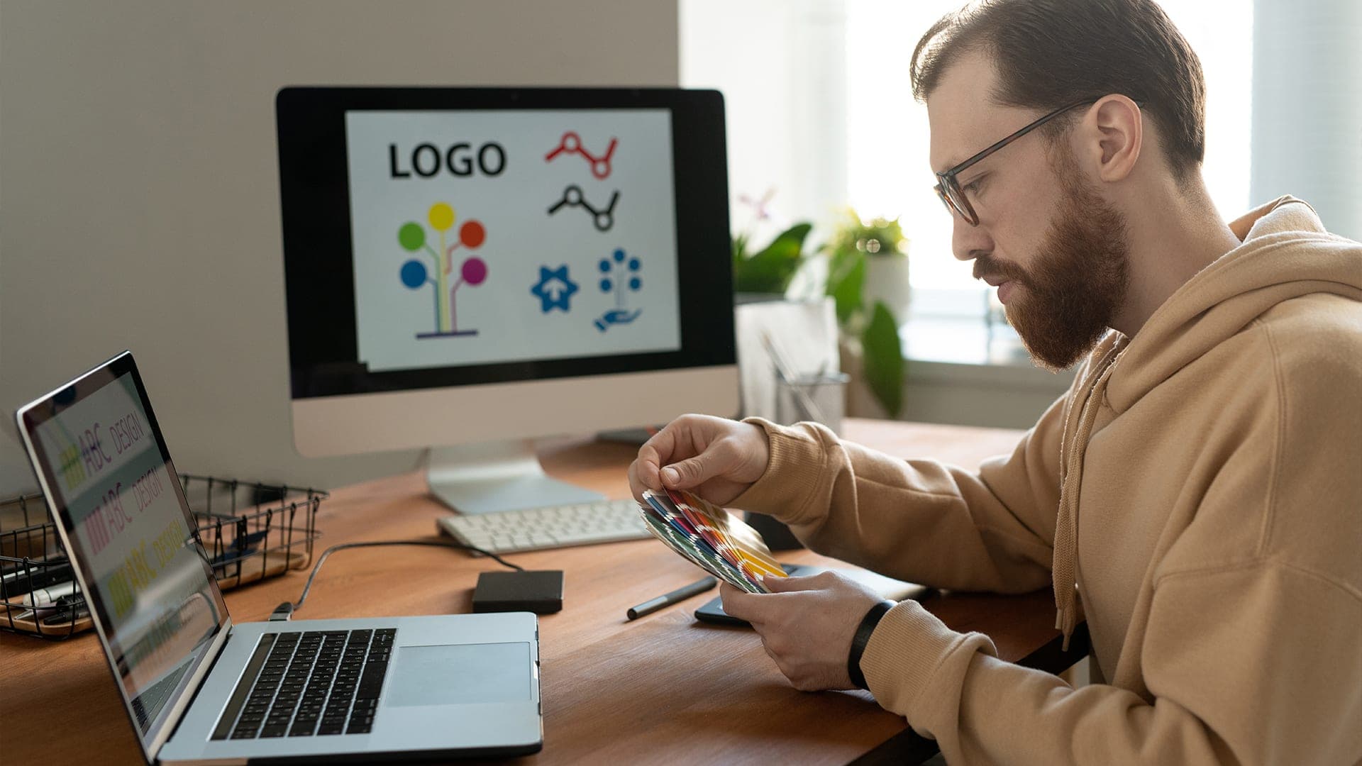
You can spot a rushed logo the same way you spot a rushed haircut. It might look “okay” for a day. Then you see it in a real photo, on a dark background, on a tiny phone header, or printed on something expensive and it falls apart.
And the annoying part is this: you usually notice it after you have already used it everywhere.
That is the real reason people pay for logo creation services. Not to get a “cool design.” To get a mark they can use without holding their breath every time it shows up in public.
A Logo Is Not Just A Picture
A logo is a shortcut in someone’s brain. It is how they recognize you fast, even when they are scrolling or walking past a sign or skimming an email.
If your logo is unclear, too detailed, or feels like a template, the shortcut breaks. People do not trust it. They do not remember it. They do not feel confident clicking, calling, or buying.
Where Your Logo Actually Shows Up
Most businesses think “website and Instagram.” In reality, your logo ends up in dozens of places:
- Website header and footer
- Social profile images and post templates
- Google Business Profile
- Email signatures
- Proposals, invoices, and documents
- Ads and thumbnails
- Packaging, labels, and stickers
- Signage, uniforms, vehicles
- App icons and favicons
A logo that only looks good in a clean mockup is not done. It needs to survive the messy real world.
The Hidden Cost Of A Cheap Logo
Cheap logos do not always look terrible. They usually look “fine” until the moment you need them to work.
Here is what happens later:
You pay for business cards and realize the logo is blurry because it was not made as a proper vector. You set up social profiles and the logo gets cropped into a circle and suddenly the important part disappears. You put it on a dark background and it turns into a black blob. You ask someone to place it on a banner and they stretch it because there are no usage rules.
Then you start changing it, little by little, trying to fix it with duct tape. After a few months, your brand looks inconsistent, and nobody can tell what the “real” version is.
That is how “cheap” becomes expensive.
What You Are Paying For When You Hire Logo Creation Services
When you pay for logo creation services, you are paying for decisions that stop problems before they start.
You are paying for someone to think through:
- What the logo should say about your brand without words
- How it should feel (modern, classic, calm, bold, premium, friendly)
- What it should avoid so you do not look like your competitors
- How it holds up when it is tiny
- How it prints, not just how it looks on a screen
- How it stays consistent across teams and tools
A good logo is not “a file.” It is a small system you can reuse everywhere.
The “Worth It” Deliverables
A professional logo package should not leave you guessing. At minimum, you should expect files you can actually use in real situations.
| Deliverable | Why it matters in real life |
| Vector files (SVG, EPS, or AI) | Crisp at any size, needed for print and signage |
| Transparent PNGs | Quick use on web, slides, social posts |
| Black and white versions | Works on any background, stamps, invoices |
| One-color version | Embroidery, engraving, single-ink print |
| Horizontal and stacked layouts | Fits different spaces without stretching |
| Simple logo rules (clear space, min size) | Stops misuse and keeps consistency |
If a provider sends only a JPG and calls it done, that is not a complete service. That is a quick output.
Why Logos Fail When They “Look Fine”
A lot of weak logos are not ugly. They are fragile.
They fail because they were not tested.
Size problems
If your logo has thin lines, tiny details, or complicated shapes, it will look messy at small sizes. This is where it shows:
- Favicon in a browser tab
- Instagram profile icon
- Google results thumbnails
- Mobile header bars
- App icon sizes
A strong logo stays readable when it is small. That usually means clear shapes, balanced spacing, and smart simplification.
Contrast problems
Some logos only work on white backgrounds. Real brands do not live on white backgrounds forever.
A professional logo needs to work on:
- Light backgrounds
- Dark backgrounds
- Busy backgrounds (photos, patterns, textures)
- Single-color situations
This is not about making ten versions. It is about making one logo that can adapt without losing its identity.
“Generic” problems
A logo can be clean and still feel like it belongs to nobody. That usually happens when it relies on common templates or trendy icons that every industry uses.
If your logo looks like five competitors in your area, you are not building recognition. You are blending in.
What A Good Logo Process Looks Like
If you want to judge whether a provider is serious, look at their process. The process tells you how much thinking is happening.
Discovery that is actually useful
A strong start is not a long meeting for no reason. It is a focused conversation that answers key questions:
- Who is your customer?
- What do you sell, in simple words?
- What do people trust you for?
- What tone do you want: premium, approachable, bold, minimal, classic?
- Where will the logo be used the most?
- Who are the competitors and what should you avoid looking like?
If the provider does not ask much, the logo usually ends up generic. They are guessing.
Concept directions, not tiny variations
Early concepts should show different ideas, not the same logo in three colors.
A professional approach usually gives you a few directions that each have a clear reason behind them. Even if you do not like one direction, it helps clarify what you do want.
Typography that is treated with care
Fonts can make a logo feel expensive or cheap in seconds.
A good provider will adjust spacing, letter shapes, and alignment so the wordmark looks intentional. Small changes here can make a huge difference in how “professional” the logo feels.
Testing before final
This is one of the biggest reasons logo creation services are worth it. The best teams test early so you do not learn the hard way later.
They check the logo in places that matter:
- Small size in a header
- Cropped into a circle
- Black only, white only
- Printed on paper
- On a simple sign mockup
It does not need to be a fancy presentation. It just needs to catch problems.
The part people forget: your team will use this logo
Even if you love the final design, your logo can still get ruined by misuse.
A logo gets stretched in Canva. Someone changes the color “to match the post.” A vendor traces it poorly. A new employee grabs the wrong file from an old folder.
This is why a simple set of rules matters. Not a 40-page brand book. Just enough guidance to keep the logo consistent.
A short logo guide should cover
- Correct versions to use (color, black, white)
- Clear space around the logo
- Minimum size for readability
- Background rules
- A few “do not do this” examples
That little document saves you from slow brand damage over time.
If you want a logo you can use everywhere without second-guessing, contact TCU for logo creation.
DIY vs Template vs Professional Help
Some people feel guilty paying for design. You do not need to. You just need to choose the right option for where your business is right now.
Here is a quick comparison:
| Option | When it can work | Where it usually fails |
| DIY logo maker | early testing, side hustle, short-term use | looks generic, weak files, poor scalability |
| Cheap marketplace gig | very tight budget, simple needs | inconsistent quality, limited thinking, weak deliverables |
| Professional service | serious brand, long-term growth, paid marketing | higher upfront cost, but fewer future fixes |
If you are spending money on marketing, ads, or a new website, your logo becomes more important because more people will see it. That is when logo creation services start paying for themselves quickly.
What “Worth It” Looks Like In Day-To-Day Business
People think logo value is emotional. In reality, it shows up in small practical ways.
Your website looks more credible
A clean logo makes your site feel like a real business, not a placeholder. It supports trust, especially for new visitors.
Your marketing looks consistent faster
With the right logo files and basic rules, your social posts, ads, and PDFs look like they belong to the same brand. That consistency is what makes people remember you.
You stop wasting time on design debates
A strong logo direction makes later design easier. It becomes the anchor. Your team stops arguing about random colors and starts focusing on the message.
You reduce future redesign costs
When a logo is built properly, you are less likely to replace it in six months. That alone can make the investment worth it.
File Formats
If you want to avoid headaches, you need the right files. This is one of the most practical benefits of logo creation services.
What each file is for:
- SVG: Best for websites. Crisp at any size.
- PNG: Great for quick digital use. Transparent background.
- EPS or AI: Best for print, signage, and vendors.
- PDF (vector): Often accepted by printers and easy to share.
If you only have a JPG, you will eventually hit a wall. That is when the blurry print problem starts.
Quick vendor check
Before you pay, ask one simple question: “Will I get vector files and a one-color version?”
If the answer is unclear, do not move forward.
When logo creation services might not be the priority
There are cases where you can keep it simple for now.
You are still proving the offer
If you are still figuring out what you sell, who you sell it to, or whether the business will stick, a clean text-based logo can be enough.
You have bigger fires to put out
If your website is broken, your pricing is unclear, or your product is unfinished, focus there first. A logo cannot fix a confusing offer.
That said, once you are ready to scale, your logo becomes part of the trust layer. That is when logo creation services make more sense.
Sometimes a logo is not just a logo. It is part of a website rebuild, a product launch, packaging, or an app.
When the logo needs to work inside a digital product, some teams look for partners who understand both brand design and product thinking. You might hear names in those conversations, especially when branding and app visuals need to match cleanly.
The point is not to chase a name. The point is to make sure your logo will work wherever your brand lives, including UI icons, app headers, and tiny in-product spaces.
How To Choose The Right Provider
You do not need fancy criteria. You need a few solid checks.
Ask to see real examples in real use
Portfolio mockups can hide issues. Ask to see:
- A logo at small size
- A logo on dark background
- A one-color version
- A print example if possible
A good designer is not bothered by this. They expect it.
Ask about revisions
You want to know:
- How many revision rounds are included?
- What counts as a “revision”?
- How feedback is handled?
Unlimited revisions can sound nice, but it often turns into endless tweaking. A good process has structure.
Ask what you will receive at the end
If you only remember one thing, remember this: deliverables matter.
Ask for a clear list of:
- File formats
- Logo versions
- Color codes
- Font details
- Basic usage rules
If it is vague, the end will be messy.
Bottom Line
A logo is worth paying for when it becomes a reliable tool, not a fragile graphic. You want something that stays readable when it is tiny, stays clear when it is printed, and stays consistent when your team uses it across different platforms.
That is what good logo creation services provide: fewer problems, fewer re-dos, and a brand mark you do not have to apologize for.
If your business is serious about being taken seriously, a logo that holds up everywhere is not a luxury. It is basic brand hygiene.
And once it is done right, you stop thinking about it. You just use it. That is how you know you got your money’s worth from logo creation services.
