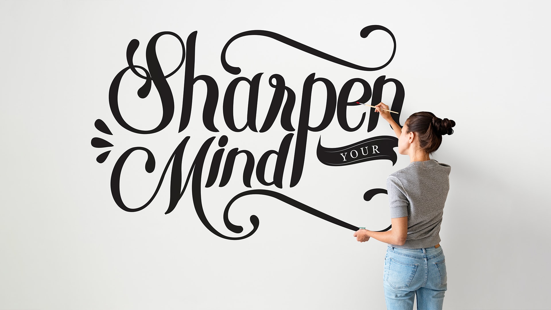
Typography is often called the silent voice of design. People may not always notice it, but they feel it. The way text looks affects how users read, how long they stay, and whether they trust a brand. As we move toward 2026, typography is changing in ways that are more thoughtful, human, and experience-driven.
At The Creative Unit, typography is a core part of everything we build. From websites and mobile apps to logos, branding systems, and digital marketing campaigns, we see how the right typography can shape success. In this blog, we explore the top typography trend in 2026, explained in clearly for business owners, designers, developers, and marketers.
This is not about following trends blindly. It is about understanding how typography is evolving and how to use it wisely in real-world design projects.
Why Typography Is More Important Than Ever
Design today is not just about looking good. It is about communication. Typography controls how messages are delivered and how they are understood.
In 2026, users consume content everywhere. They read on phones while walking, scroll on tablets at home, and browse websites on large screens at work. If typography does not adapt, users lose interest quickly.
This shift in behavior is driving the top typography trend in 2026, pushing designers to focus on readability, flexibility, and emotional connection.
A Strong Move Toward Human-Centered Typography
One of the most noticeable shifts in typography is the move away from cold, mechanical fonts. In 2026, typography feels more human.
Designers are choosing fonts with softer curves, open shapes, and natural spacing. These fonts feel welcoming and familiar. They reduce eye strain and make reading feel more comfortable, especially during long sessions.
This human-centered approach is not accidental. It reflects how people want digital experiences to feel less robotic and more personal. This mindset sits at the heart of the top typography trend in 2026.
Clean Fonts That Still Have Character
Minimal design is still popular, but it has grown more refined. Instead of plain and generic fonts, designers now choose clean typefaces with subtle personality.
These fonts do not scream for attention. Instead, they quietly support the message. Small design details, such as unique curves or slightly altered letter endings, give these fonts character without hurting clarity.
For brands that want to look modern, trustworthy, and confident, this trend is especially valuable.
Spacing Becomes a Design Priority
Spacing is often overlooked, but it plays a huge role in how text feels. In 2026, designers are paying close attention to spacing at every level.
Line height, letter spacing, and margins are adjusted carefully to create breathing room. This makes content easier to scan and more pleasant to read.
Better spacing is especially important for mobile-first design. Clean spacing supports the top typography trend in 2026 by improving usability across all screen sizes.
Variable Fonts Go Mainstream
Variable fonts are changing how designers work. Instead of loading multiple font files, designers can now use one flexible font that adjusts weight, width, and style.
In 2026, variable fonts are becoming a standard choice for websites and apps. They improve performance, reduce loading times, and allow smoother transitions between text styles.
For development teams, this means better efficiency. For users, it means consistent and readable typography no matter the device.
Accessibility Shapes Typography Choices
Accessibility is no longer optional. In 2026, typography must work for everyone.
Designers now prioritize fonts that are easy to read for users with visual challenges, learning differences, or older screens. Clear letter shapes, strong contrast, and reasonable font sizes are key.
This focus on accessibility is a major part of the top typography trend in 2026, and it also helps brands meet modern design and legal standards.
Serif Fonts Return with a Fresh Look
For years, sans-serif fonts dominated digital design. Now, serif fonts are making a strong return.
In 2026, modern serif fonts are lighter, cleaner, and more adaptable. They work well on screens and add a sense of authority and depth.
Many brands use serif fonts for headlines, editorial sections, or premium branding. This blend of tradition and modern design fits naturally into the top typography trend in 2026.
Custom Typography Builds Stronger Brands
More businesses want to stand out in crowded digital spaces. That is why custom typography is growing fast.
Instead of relying on popular fonts used by thousands of brands, companies are creating custom typefaces or modifying existing ones. This helps build a unique visual identity.
Custom typography strengthens logos, websites, apps, and marketing materials. It also creates consistency across all platforms.
When typography is paired with strong content strategies, some brands also choose to contact Fleck Publisher for professional publishing and content solutions alongside their design work.
Handwritten Fonts Add a Human Touch
In a world filled with digital content, handwritten-style fonts bring warmth and personality.
In 2026, these fonts are carefully designed to look natural without being messy. They are often used in small doses, such as highlights, quotes, call-to-action buttons, or creative sections.
This trend supports emotional connection, which is an important part of the top typography trend in 2026.
Bold Headlines That Guide Users
Users rarely read everything. They scan first.
In 2026, typography helps guide attention through strong but balanced headlines. Designers use size, weight, and spacing to create clear reading paths.
Bold headlines help users understand content quickly, especially on websites, blogs, and landing pages. This improves engagement and reduces bounce rates.
Thoughtful Font Pairing Takes Center Stage
Using multiple fonts is common, but pairing them well requires skill.
In 2026, designers focus on harmony. Fonts are paired to create contrast without conflict. A modern serif might be paired with a clean sans-serif, or a bold display font with a neutral body font.
This careful pairing supports the top typography trend in 2026 by balancing creativity with clarity.
Typography That Works Everywhere
Design no longer lives on one platform. A brand’s typography must work on websites, apps, emails, ads, and social media.
In 2026, designers choose fonts that scale well and stay readable at different sizes. Responsive typography ensures a consistent experience across all touchpoints.
This flexibility is essential for modern businesses and is a key part of the top typography trend in 2026.
Emotion-Driven Typography Becomes More Common
Typography is now used to express emotion, not just information.
Fonts can feel calm, energetic, serious, playful, or inspiring. In 2026, designers choose typography based on the mood they want to create.
This emotional approach helps brands connect with users on a deeper level, making design more meaningful and memorable.
Typography and Branding Work Hand in Hand
Typography plays a major role in brand recognition. When users see consistent typography across platforms, trust grows.
In 2026, brands treat typography as a long-term asset. It is planned carefully and used consistently across all visual materials.
This strategic use of typography supports strong branding and long-term growth.
How Businesses Can Use These Trends Smartly
Not every trend fits every brand. The goal is not to copy others, but to choose what works best for your audience.
Before selecting typography, businesses should consider:
- Who their users are
- Where the content will be viewed
- What message the brand wants to send
At The Creative Unit (TCU), we help businesses make these decisions with clarity. Our team provides complete design and development solutions, including websites, apps, branding, logos, and digital marketing.
Final Thoughts
Typography in 2026 is thoughtful, flexible, and deeply human. It is not about flashy fonts or short-lived styles. It is about making digital experiences clearer, warmer, and more effective.
Understanding the top typography trend in 2026 helps businesses create designs that last and connect with real people. Whether you are building a new brand, redesigning a website, or launching a digital product, typography plays a powerful role.
And when design projects involve content creation or publishing support, many businesses still choose to contact Fleck Publisher for expert writing, publishing, and marketing solutions.
As technology continues to evolve, one truth remains the same: good typography is timeless.

