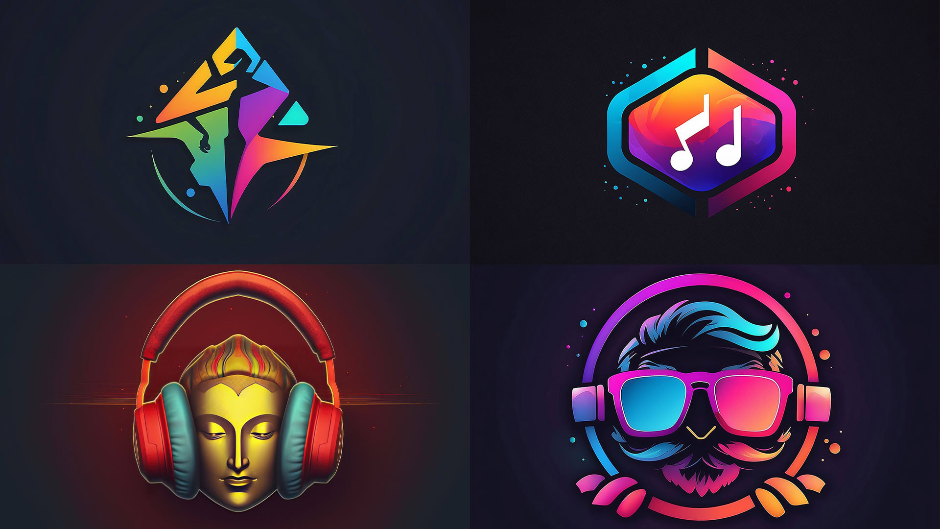
The entertainment industry is a rare beast. It is a world of magic, excitement, and creativity, but it is also a ruthless, multi-billion-dollar machine built on contracts, deadlines, and serious partnerships.
When a new event promoter, game studio, or production house sits down to design its logo, it faces a tough question: Should the logo be playful capturing the fun, energy, and escapism of the product? Or should it be professional signaling the stability, trustworthiness, and competence needed to handle major deals?
Choosing the wrong direction can be disastrous. A logo that’s too playful might not be taken seriously by investors. A logo that’s too professional might bore the audience.
This article provides a deep look at how a logo for entertainment company must balance these two powerful forces. It details the steps needed to find the perfect creative balance that wins both contracts and fans.
Defining Your Brand’s “Tone of Voice”
Before a single line is drawn, a business must clearly define its identity. The “playful vs. professional” decision is not a matter of taste; it’s a matter of strategy.
The Two Poles of Entertainment
The core of the entertainment industry falls into two general tones, and the logo must follow suit:
| Tone Category | Core Value | Target Audience | Target Audience |
| Playful/Expressive | Excitement, Fun, Escapism, Originality | Consumers (B2C), Young Adults, Fans, Artists | Focus: Color, Typography (custom, hand-drawn), Dynamic shapes. |
| Professional/Formal | Stability, Reliability, High-Budget Production, Investment | Investors (B2B), Studio Executives, Corporate Sponsors, Venues | Focus: Geometry, Simplicity, Classic typography, Muted/Structured colors. |
A company must ask: Is our primary goal to secure a multi-million dollar studio deal, or is it to sell a million concert tickets? The answer determines the necessary balance.
The Danger of a Mismatch
A logo mismatch is fatal. For example, a serious film financing group using a cartoon-style logo will struggle to attract credible investors. Conversely, a logo for an entertainment company that organizes children’s parties, using severe, black-and-white formal typography, will fail to excite its young audience. The logo must perfectly align with the experience being sold.
When to Choose “Playful” (And How to Do It Right)
A playful logo works best when the company’s direct consumer or product relies on emotion, fun, and immediate engagement.
The Target: The Audience Experience
If the business is a video game developer, a niche streaming platform, an independent music label, or an event production company targeting younger demographics, the logo needs energy. It needs to look exciting on merchandise and social media.
This style of logo for entertainment company benefits from:
- Vibrant Color Palettes: Using bright, unexpected colors that jump off the screen and convey energy.
- Expressive Typography: Utilizing custom-drawn lettering or highly stylized fonts that convey a specific feeling (like vintage rock, futuristic tech, or whimsical adventure).
- Character or Iconography: Incorporating a clever mascot or a distinct abstract shape that becomes a fun character in its own right.
The Professional Guardrail for Playful Logos
The mistake is letting “playful” become “amateur.” A truly effective playful logo is professionally rendered. It must be fun, but technically perfect. The lines must be sharp, the colors must be balanced, and the design must be simple enough to be used in tiny sizes.
A sophisticated designer ensures that even the most whimsical mark has the stability and quality needed to be printed on a formal contract or used in a high-resolution video title sequence.
When to Choose “Professional” (And Why It Doesn’t Have to Be Boring)
A professional logo is mandatory when the company’s success hinges on B2B trust, significant financial transactions, or institutional partnerships.
The Target: Investors and Partners
If the business is a talent management firm, a post-production house specializing in corporate video, an intellectual property (IP) holding group, or a financial service provider for the arts, the logo must exude confidence and stability. It must look expensive.
This style of logo for entertainment company benefits from:
- Clean Geometry and Simplicity: Relying on simple, timeless shapes (circles, squares, shields) that look established and serious.
- Reserved Typography: Using classic, strong, and highly legible fonts that convey authority and stability.
- Muted Color Palettes: Employing reliable colors like navy, silver, black, or deep burgundy to signal wealth and longevity.
Avoiding the “Boring” Trap
The challenge with professionalism is avoiding the “boring” trap. A professional logo doesn’t have to look like a bank. It achieves sophistication through cleverness, not clutter.
- Hidden Meaning: Using negative space or subtle line work to hide a creative symbol within a clean shape.
- Unique Typography: Selecting a classic font and professionally customizing a few key letters to add a distinct, ownable flavor without losing stability.
The goal is to look serious enough for a boardroom presentation but distinct enough to be remembered at a crowded industry event.
The Power of Balance: Achieving Sophisticated Playfulness
The best logo for entertainment company often achieves a balance sophisticated playfulness that satisfies both the investor and the fan.
The Strategic Compromise
This balanced approach is the sweet spot for most growing entertainment businesses that need to look good for both consumers and partners (e.g., a multi-platform content studio, an independent film distributor, or a national concert promoter).
Achieving this balance requires specific design tools:
- Use a Simple Mark: The symbol itself is clean and geometric (professional).
- Use an Energetic Color: The symbol is colored with a vibrant, unique palette (playful).
- Use a Classic Font: The company name uses a strong, reliable typeface (professional).
This gives the brand dual functionality: The simple mark or the clean typography can be used alone for formal contracts, while the full, colorful version excites consumers.
The Storytelling Element
The logo’s ultimate job is to tell a story about who the company is. A skilled designer will find the one central idea that connects the seriousness of the business (managing large projects) with the fun of the product (delivering joy to audiences).
For example, a logo for entertainment company focused on special effects might use a simple, strong type treatment (professional) but incorporate a subtle, dynamic energy burst hidden in the kerning between two letters (playful). It shows control over chaos.
The Critical Role of Context and Application
The decision is less about “one or the other” and more about “when and where.” A professional logo system is designed to fluidly adapt to its context.
Adapting to the Audience
A professional logo system should have a visual toolkit:
- Formal Version: A simple black-and-white or single-color version used for legal documents, invoices, and formal B2B proposals. This emphasizes the company’s stable side.
- Full Version: The primary, colorful version used on the website, social media, and merchandise. This is the version designed to engage the consumer.
- Iconic Version: A stripped-down symbol or mark used as an app icon or social media avatar.
This adaptability ensures that the business always presents the correct face to the correct audience, reinforcing professionalism where necessary and excitement where needed.
The Test of the Project
When a new project starts, the company should always ask: What is the single most important message we must convey?
- If the goal is to attract high-net-worth investors to a film project, the logo application should lean heavily on the professional elements (e.g., a simple, large, black logo on a white pitch deck).
- If the goal is to promote a summer music festival, the logo application should embrace the playful elements (e.g., vibrant colors, custom textures, and animation).
How Professional Design Removes the Guesswork
Many small businesses try to create this logo balance themselves, resulting in a confusing, cluttered mark that fails on both fronts. Professional logo for entertainment company design removes this risk entirely.
Expertise in Visual Psychology
A design expert understands the psychology of color and form. They know that using too many bright colors can look amateurish, but a single, highly saturated color against a neutral background looks deliberate and exciting. They know which font weight signals reliability versus fragility.
This expertise ensures the logo achieves the desired sophisticated playfulness—it is expressive without being childish, and serious without being dull.
Creating Ownability
The competition is using templates. The only way to guarantee a unique, legally protected, and memorable mark is through a custom process. A professional firm does not offer generic solutions; they offer an ownable mark based purely on the client’s unique story.
This is why the decision to hire professionals is not a creative luxury; it is a critical business choice that protects the brand’s long-term visual assets.
Are you struggling to find the perfect creative balance for your entertainment business? Your logo should attract investors and fans. Don’t let your brand get stuck in the middle.
Contact The Creative Unit (TCU) today if you are looking for professionals to design a logo for entertainment company. Our team specializes in creating sophisticated, dynamic visual identities that perfectly balance professionalism and playfulness for the creative economy.
The Long-Term Impact: Why Balance Equals Longevity
The final argument for a balanced logo lies in its durability. Trends in the entertainment world move fast, but a logo must endure.
A Timeless Structure
A balanced logo usually features a simple, clean core structure (the professional element) that allows the colors, textures, or supporting graphics (the playful element) to change without collapsing the entire brand identity. This separation of form and style guarantees longevity.
A logo for entertainment company built on this principle can survive creative shifts, changes in leadership, and expansion into new markets without needing a costly, confusing overhaul. It remains recognizable even as its style adapts.
The Foundation for Sub-Brands
For a growing entertainment company, sub-brands are inevitable (e.g., a “Film” division, an “Events” division). A balanced, simple core logo acts as the perfect parent mark, providing a unified, professional foundation for all the smaller, more specialized, and perhaps more playful divisions underneath it. The professional mark holds the company together, while the playful marks define the experience.
This ability to structure a cohesive brand family is essential for scaling a business that relies on multiple income streams.
Conclusion:
Mastering the Dual Identity
The question of whether a logo for entertainment company should be playful or professional is the wrong question. The right question is: How can it be both?
The most successful entertainment brands—the ones that secure big deals and sell out venues—master this dual identity. They use a professional core to communicate stability to stakeholders and a playful execution to generate excitement with fans.
The choice you make on your logo’s tone will determine who takes your business seriously, who buys your product, and how fast you can grow. It is a strategic decision that demands expert attention.
Don’t let your business be defined by an accidental logo. Invest in a sophisticated mark that tells your complete story: the serious commitment to quality and the thrilling promise of entertainment.

