If you walked into a crucial business meeting, would you wear a stained, ill-fitting suit or something sharp, tailored, and professional? The choice is obvious. Yet countless small businesses send their logo—the single most important visual asset—out into the digital world, making it look generic, dated, or simply cheap.
This isn’t just about looking nice; it’s about immediate, subconscious trust. Before a potential client reads a single word on your website or hears your stellar pitch, they make a judgment about your company’s professionalism, stability, and attention to detail based entirely on that small graphic mark.
A poorly conceived or hastily designed logo is far more than just bad design; it’s a direct obstacle to building the confidence of serious B2B buyers and earning high-value contracts. It signals a lack of strategic investment, a quality that instantly raises a red flag in any competitive market.
This article goes beyond simple aesthetics. It explores the critical, functional role of professional logo design services and explains why this investment is the foundation of genuine digital authority and long-term brand equity. We will dissect the strategic thinking behind great marks and examine the functional trends shaping the future of powerful brand identity.
The High Cost of the “Quick Fix” Logo
For a growing business, the pressure to save time and money is constant. But when a corner is cut on the logo, the price is paid daily in lost opportunities and diminished perception. A logo is not an add-on; it is the visual bedrock of your entire marketing strategy.
1. The Confusion of the Crowd: Losing Differentiation
The greatest purpose of a logo is to make your brand instantly recognizable and memorable. When a small business uses a simple, template-based icon from a free generator, that mark is likely being used by hundreds—perhaps thousands—of other businesses worldwide. The customer’s brain defaults to confusion: Wait, is this the one I talked to? In the split-second of assessment, your brand’s unique identity is lost, and your digital authority is compromised. Differentiation is not a luxury; it’s survival.
2. The Failure of Scale: From Icon to Billboard
Think about all the places your logo lives: a tiny favicon in a browser tab, a social media profile picture, a large banner ad, or printed on a business card. A truly powerful logo must function perfectly at all these scales. Poorly designed logos often become blurry, lose crucial detail when scaled down, or look crude when enlarged. Professional logo design services ensure the mark is provided in high-resolution, vector formats that can be scaled infinitely without any loss of quality or technical detail, which is non-negotiable for print and large-scale applications.
3. The Subconscious Signal of Amateurism
The logo’s choice of color, font style (typography), and geometry all work together to tell a story about the brand’s character. If a tech firm’s logo uses playful, chaotic colors or an unprofessional, handwritten font, the visual signal immediately contradicts the necessary message of trust, stability, and innovation. The lack of thoughtful design creates a subconscious barrier that the best sales team in the world will struggle to overcome. The quality of your mark is often judged as the quality of your service.
The Four Strategic Pillars of Great Logo Design
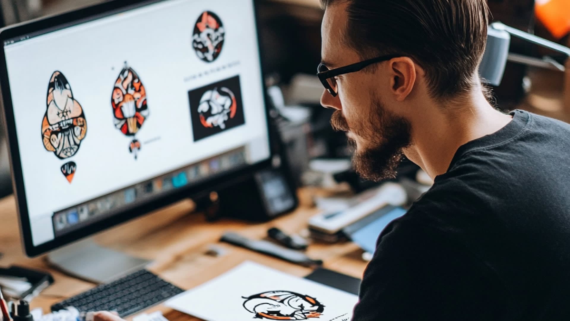
To achieve long-term recognition and perform its function effectively, a logo must be built on a strategic framework. The process delivered by professional logo design services ensures that the design serves the business, not the designer.
Pillar 1: Strategic Simplicity
The most effective logos are deceptively simple. Simplicity allows the mark to be instantly read, regardless of size or background color. A great designer knows the power of a single, clean geometric shape or an iconic symbol. This focus ensures the logo remains strong and impactful even in a basic monochrome format, which is vital for versatility and low-cost printing.
Pillar 2: Technical Versatility
A modern logo must be fluid. It needs to work beautifully on a light background, a dark background, a textured surface, and when compressed for speed on a website. Expert logo design services provide a system of marks, not just one image, including horizontal, vertical, and icon-only versions. This technical versatility ensures the brand’s consistency and authority across every single digital and physical touchpoint.
Pillar 3: Timelessness Over Trendiness
While it’s tempting to follow the latest visual fads, the mark must be built to last. Design professionals guide the business away from overly trendy colors, shadows, or filters that will look dated within a few years. A timeless mark saves the business the enormous expense and brand confusion of having to undergo an expensive redesign every two to three years. A professional logo is an enduring investment.
Pillar 4: Industry Appropriateness
The visual tone of the logo must match the industry and the target customer’s expectations. If your business is in cybersecurity, the logo must signal stability, complexity, and protection. If the business is in modern e-commerce, it should suggest speed and ease. The appropriateness of the design, the careful selection of color, geometry, and font, is a key factor in establishing immediate trustworthiness.
Real-Life Application: The IT Consultant’s Identity Crisis
Let’s look at the situation of “ProTech IT,” a small consulting firm that had successfully grown through referrals but needed to scale to a national level. Their original logo was a stylized, complex image of a circuit board and a stylized letter ‘P’—a very common look among regional IT companies.
The Problem: When they began pitching for contracts outside of their immediate region, they often faced instant dismissal. Their complex, detailed logo looked cluttered when viewed on a conference screen, and their brand was easily forgotten. Their visual identity didn’t match the level of expertise they truly offered. They were constantly fighting to prove their professionalism.
The Solution (The Creative Unit’s Approach): The Creative Unit (TCU) was brought in to provide professional logo design services focused on sophistication and simplicity.
- Strategic Simplification: The mark was reduced to two simple, interlocking geometric shapes that subtly suggested partnership and security, eliminating the circuit board clutter.
- Typography Focus: A specific, clean, modern sans-serif font was chosen, with custom kerning (letter spacing) to give the wordmark a proprietary and polished feel.
- Comprehensive Guidelines: TCU created a detailed brand manual that dictated exactly how the new logo should be used on all technical documentation, ensuring consistency across every internal and external document.
The Result: The clean, sophisticated new logo instantly elevated ProTech IT’s pitch deck, giving the sales team a noticeable lift in confidence. The company reported that the simplified, authoritative logo immediately opened doors to larger B2B conversations. The investment in professional logo design services provided the visual credibility they needed to be taken seriously on a larger stage.
Is your current logo actively undermining the high quality of your service?
Contact TCU, if you are looking for logo design services. The Creative Unit specializes in creating strategic, impactful brand marks that build immediate trust and authority.
Upcoming Trends: Building a Logo for the Future
To maintain relevance and a modern edge, a business needs a logo that is future-proof and ready for the dynamic nature of digital screens. Expert logo design services must build the mark with emerging technology in mind.
Trend 1: Functional Minimalism and Clarity
The push toward extreme simplicity continues, driven by the need for logos to function perfectly as tiny app icons, website favicons, or social media avatars. This is not just a style choice; it’s a technical requirement. The focus is on perfect geometry and single, bold shapes that are legible at any size. The logo’s primary job is to be an unforgettable symbol, not a complicated illustration.
Trend 2: Responsive and Fluid Logos
A single fixed logo is outdated. Modern design utilizes responsive logos, where the complexity of the mark changes based on where it appears. On a large desktop screen, the full logo with the company name is visible. On a tiny mobile screen, it gracefully reduces to just the essential symbol or initials. This ensures the best possible user experience and maintains brand recognition regardless of screen size.
Trend 3: Motion and Subtle Digital Polish
As websites and apps become more dynamic, incorporating small, elegant logo animations is growing in popularity. A slight, subtle motion, a line closing into a circle, or elements briefly shifting into place can be used during welcome screens or loading sequences. This adds personality and technological sophistication without distracting the user, offering a modern touch that elevates the brand’s polish.
Trend 4: The Power of Custom Typography
More businesses are relying solely on the unique look of their company name as their logo. This trend, known as a wordmark, puts immense pressure on typography. Professional logo design services spend time creating custom font modifications, adjusting every curve and space (kerning) to make the wordmark look proprietary and unforgettable, ensuring the company name itself becomes a powerful visual identifier.
The Value of Comprehensive Logo Design Services
A cheap logo might give you an image, but expert logo design services give you a fully documented, protected brand asset. This is the distinction that matters to professional organizations.
Strategic Discovery and Research
The process begins with deep strategic conversation, not design software. Designers conduct research to understand the competitive landscape, the target audience’s expectations, and the company’s long-term goals. This foundational research ensures the final design is not just something you like, but something that is engineered to work in your specific market.
Legal Protection and Expert Deliverables
A professional firm guarantees that the final mark is 100% original, protecting the business from future copyright and legal risks that often plague logos made with stock icons. The deliverables include high-resolution vector files (AI, EPS) that allow for infinite scaling, along with optimized digital files for every web application. This technical precision is essential for avoiding future technical debt.
The Essential Brand Guideline Manual
This document is the logo’s rulebook. It details the logo’s exact color codes (for print and digital), the clear space required around the logo, the specific fonts to be used with the logo, and examples of correct and incorrect usage. This manual is vital for maintaining brand consistency across all marketing departments, ensuring the logo always projects unified authority and trustworthiness.
Conclusion:
Your Logo as a Critical Investment
For a small business committed to securing high-value clients and building genuine market authority, the quality of its visual identity cannot be a compromise. The logo is the single most efficient, cost-effective tool for building immediate trust and securing instant recognition in a crowded, fast-paced world.
The Creative Unit (TCU) views the logo not as a piece of art, but as a strategic asset for growth. By integrating deep market research with meticulous technical execution, we ensure that the professional logo design services we provide are built for durability, scalability, and long-term business success. Don’t let a weak first impression hold back your powerful business.
