A good logo animation is not “a cool effect.” It is a tiny brand moment that either upgrades perception or makes the brand feel cheap. In 2026, when short-form video is everywhere and attention is brutal, that micro-moment matters more than most teams think. HubSpot’s roundup of industry research notes that 89% of businesses use video marketing and 93% of marketers report strong ROI from video. If video is doing that much heavy lifting, your brand’s first two seconds should not be random.
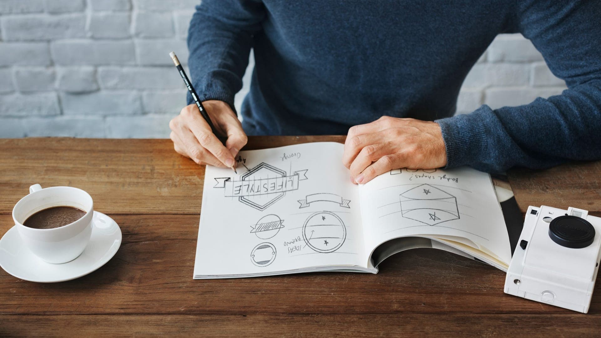
That is why the best animations start on paper. Not in After Effects. Not with a plugin. They start with a script and a storyboard that force clarity: what the brand stands for, what the motion should make people feel, and what the logo should look like at the end.
This guide gives you a simple way to write a logo animation script and storyboard that feel intentional, premium, and easy to produce. It also includes a fill-in template you can copy and use immediately. If you are comparing studios for the best animated logo design services, you can also use this as a litmus test. A serious team will talk in story beats, timing, and brand cues, not just “effects.”
What Is A Logo Animation Script?
A logo animation script is not dialogue. It is a short set of directions that describe:
- what the viewer sees (action)
- what the viewer hears (sound or silence)
- the emotional arc (how it should feel)
- the timing (how long each beat lasts)
- the final hold (how long the logo sits clean)
Your storyboard is simply the script, but visual. It turns “the logo draws on” into frames that show how it draws on, from where, and with what rhythm.
When people skip the script, they end up with animations that are “technically nice” but emotionally empty. Or worse, trendy in a way that ages fast.
A note on taste in 2026: a lot of brands are intentionally leaning toward more human, crafted design again, as a reaction to overly slick AI aesthetics. Creative Bloq has described this broader shift toward texture, warmth, and more human-centric visuals in 2026 design trends. That does not mean every logo animation needs grain or vintage vibes. It means your motion should feel like it belongs to a real brand, not a template pack.
The Only Question That Matters Before You Write Anything
Before you outline scenes, answer this in one sentence:
“When someone sees this logo animation, what should they feel about the brand?”
Examples:
- “This brand is calm, premium, and trustworthy.”
- “This brand is fast, modern, and sharp.”
- “This brand is playful, creative, and bold.”
- “This brand is technical, precise, and confident.”
That sentence is your filter. If a motion idea does not support that feeling, cut it.
This is also the difference between average motion work and the best animated logo design services. The best studios are not selling animation. They are selling brand perception.
A Simple Framework That Keeps Your Animation From Drifting
Almost every great logo animation follows the same underlying arc, even when the style is different:
- Entry: something grabs attention without feeling noisy
- Reveal: the mark and/or type appear in a deliberate way
- Resolve: everything locks into place cleanly
- Hold: the full logo sits long enough to register
- Exit (optional): fades out or transitions into content
You can do this in 2 seconds or 8 seconds. The arc stays.
Now let’s turn that into a script.
The Perfect Logo Animation Script and Storyboard Template
Copy this template into a doc, fill it, then hand it to your designer or animator. It works whether you are making a clean tech reveal, a hand-drawn build, a 3D morph, or a kinetic typography moment.
Project header
Brand name:
Logo components: (icon, wordmark, tagline, symbol, monogram)
Primary use: (YouTube intro, website hero, app splash, ads, reels, presentations)
Target duration: (2s, 3s, 5s, 7s)
Format needs: (16:9, 1:1, 9:16, transparent background, Lottie, MP4)
Brand feeling in one sentence:
Do not do list: (what to avoid, ex: “no glitch,” “no childish bounce,” “no loud swooshes”)
Style anchors
Pick two or three words only.
Motion adjectives: (clean, elastic, sharp, fluid, gritty, minimal)
Energy level: (low, medium, high)
Camera feel: (static, subtle push-in, parallax, 3D orbit)
Reference brands: (optional, not for copying, just vibe)
Scene-by-Scene Storyboard and Script
Scene 1: The first 0.3 to 0.8 seconds (entry)
Time: 0.0s to ___s
Visual: What appears first? (a line, a shape, a texture, a light sweep, a particle trail, a mask reveal)
Motion: How does it move? (ease in, snap, glide, draw-on, scale, rotation)
Purpose: What does this communicate? (precision, warmth, speed, craft)
Sound: (none, soft whoosh, subtle click, organic pencil, digital ping)
Storyboard frame note: Sketch the first visible element and where it comes from.
Scene 2: The build (reveal begins)
Time: ___s to ___s
Visual: What forms next? (icon outline, icon fill, letterforms, negative space)
Motion: What is the “signature move”? (stroke draw, fold, morph, assemble, extrude)
Pacing: fast or slow? where does it breathe?
Sound: match the movement, not the ego
Storyboard frame note: Sketch mid-build. Show what is partially formed.
Scene 3: The moment of recognition (logo becomes readable)
Time: ___s to ___s
Visual: The logo hits a readable state. What is visible now?
Motion: Does it overshoot and settle, or lock instantly?
Brand cue: What makes this uniquely yours? (a distinctive angle, a custom curve, a brand pattern)
Storyboard frame note: This frame should look like “yes, that’s the brand.”
Scene 4: Resolve and polish (final lock)
Time: ___s to ___s
Visual: Everything aligns. Tagline appears (if used). Colors finalize.
Motion: subtle finishing move (micro bounce, shimmer, soft easing)
Sound: optional final accent (tiny click, soft hit)
Storyboard frame note: This is your “final logo on screen” frame.
Scene 5: Hold (do not rush this)
Time: ___s to ___s
Visual: Full logo stays clean and stable.
Hold duration: at least 0.6 to 1.2 seconds for most use cases.
Reason: Humans need a beat to register and remember.
Scene 6: Exit or transition (optional)
Time: ___s to ___s
Visual: fade, wipe, scale down, transition into next video content
Rule: exit should not steal attention from the logo itself
The “fill-in script” Logo Animation (super fast)
If you want a copy-paste paragraph script, use this and swap the bracketed parts:
SCRIPT DRAFT:
“On a (solid/textured/gradient) background, a (line/shape/light sweep) enters from (direction) and begins forming the (icon/monogram) using a (draw-on/assemble/morph) motion that feels (motion adjectives). As the icon completes, the wordmark appears with a (slide/fade/mask reveal), timing the first readable moment at (time). The full logo locks into place with a subtle (settle/snap/ease) and holds clean for (hold duration). The animation ends with a (fade/transition) into (use case). Sound is (none/minimal) with (one or two) subtle accents that match the motion.”
This script is short, but it is complete. A pro animator can build from it without guessing.
How Long Should A Logo Animation Be?
Shorter is winning most of the time.
HubSpot’s report highlights that marketers plan to invest heavily in short-form video and that short-form often delivers high ROI compared to other formats. That does not mean your logo animation must be 1.5 seconds. It means you should earn every second.
A practical rule:
- 2 to 3 seconds: ads, reels, intros, social
- 4 to 6 seconds: premium brand films, YouTube openers
- 7 seconds+: only if it is part of a longer story sequence
If you have the logo already and you just want the animation to feel premium and brand-right, TCU can help. We plan the script, storyboard, and motion system first, then produce the animation in the formats you actually need. If you are hunting for the best animated logo design services, this is exactly what you should expect from the team you hire.
Quick Production Notes That Prevent “Great Storyboard, Bad Final Output”
A few things ruin logo animations even when the concept is good:
Legibility loss: Your logo must be readable in small sizes. Always preview it like it will appear on a phone.
Over-styling: The animation should serve the logo, not replace it. If the effect is the star, the brand is forgotten.
Bad easing: Cheap easing makes expensive design feel amateur.
Audio mismatch: Loud swooshes on a calm premium brand kill the mood instantly.
No hold: If the logo disappears too quickly, you lose recognition.
Also, decide early whether you need:
- Transparent background (for overlays)
- Lottie (for websites and apps)
- Multiple aspect ratios (9:16, 1:1, 16:9)
These decisions change how the animation is built.
Closing Thoughts!
A perfect logo animation is not magic. It is clarity, translated into motion.
When you write the script and storyboard first, you remove guesswork and you stop the project from turning into “try another effect.” Whether you produce it in-house or hire the best animated logo design services, the template above gives you a clean starting point that leads to a final animation that feels intentional, not generic.
Frequently Asked Questions
What is the difference between a logo animation script and a storyboard?
The script describes the action, timing, and sound in words. The storyboard turns those words into frames so the animator can build accurately.
Do I need a storyboard if I am hiring professionals?
Yes. Even the best animated logo design services will storyboard, even if it is lightweight. It prevents revision chaos and keeps the animation aligned with brand intent.
What makes a logo animation feel expensive?
Clean timing, tasteful easing, strong legibility, and a brand-specific motion cue. Not flashy effects.
Should I use sound in my logo animation?
If it will be used in video intros or brand films, subtle sound can enhance it. For website animations, you often skip sound. If you include sound, keep it minimal and matched to the brand tone.
Can I use the same logo animation on my website and social media?
You can reuse the concept, but you usually need multiple exports and sometimes a simplified version for smaller screens. If you want the best result, build a motion “system” that adapts.
How do I choose the best animated logo design services?
Ask to see storyboards, not just final videos. Ask how they handle formats (Lottie, transparent, aspect ratios). Ask how they decide pacing and brand feel. A serious studio can explain their thinking clearly.
