Imagine this: you’re scrolling through your phone, and a colorful ad catches your eye. You tap on it. A new online store loads. But something feels… off. The site looks a bit messy. The name is forgettable. And the logo? It’s a generic shape you feel like you’ve seen a hundred times before. How long do you stay? Probably not long.
Now, picture a different scene. You see a recommendation for a brand a friend loves. You visit their website. It feels clean and trustworthy. At the top of the page, a simple, beautiful logo sits proudly. It looks professional. It makes you feel something. You instantly understand what this brand is about. You start browsing. You might even buy something.
What was the real difference between these two stores? In a word: branding. And at the absolute heart of that branding is a powerful, strategic ecommerce logo design.
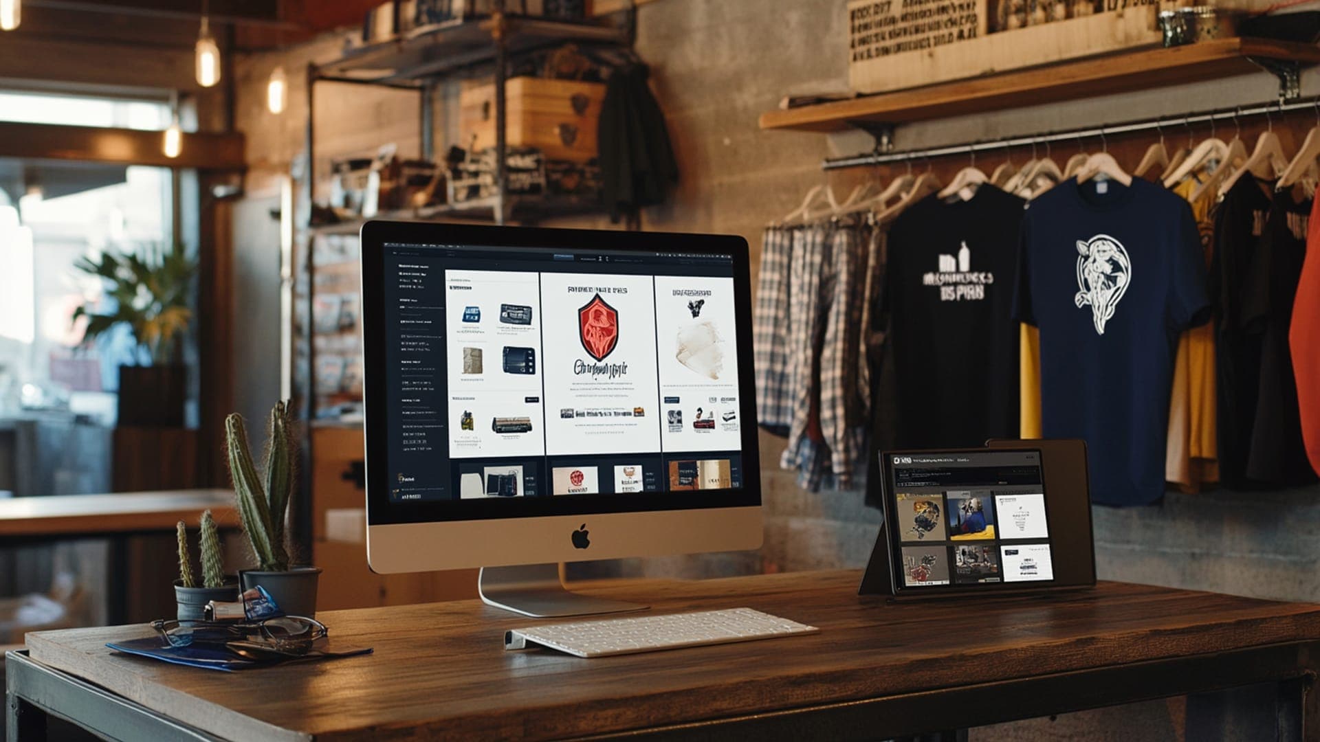
Your logo is not just a tiny picture next to your business name. In the crowded digital marketplace, it’s your silent salesperson, your first handshake with a customer, and the flag you plant to say, “We are here, and we are different.” For an ecommerce business, where you don’t have a physical storefront to impress people, your logo carries an even heavier load. It has to build trust, communicate your value, and be memorable enough to bring customers back, all in a single glance.
This blog post will walk you through why your ecommerce logo design is a make-or-break asset and how you can create one that not only looks good but actually works hard for your business.
Why Your Online Store’s Logo is Its Most Important Employee
Think about the biggest names in online shopping. Amazon. eBay. Etsy. What comes to mind? Their logos, right? These symbols become shortcuts for everything the brand represents. For your own ecommerce site, a professional logo does several critical jobs:
- Builds Instant Trust: A sloppy, unprofessional logo tells visitors your business might be sloppy and unprofessional too. A polished, well-designed logo signals that you are legitimate and care about quality.
- Makes You Memorable: Humans process images 60,000 times faster than text. A unique logo helps your shop stick in a customer’s mind long after they’ve closed the tab.
- Communicates Your Niche: Are you selling handmade jewelry or high-tech gadgets? The colors, fonts, and style of your logo can whisper your specialty to customers before they even read a word.
- Creates a Foundation for Your Brand: Your logo is the cornerstone. Your website’s color scheme, your social media posts, and even your packaging will all flow from the visual identity your logo establishes.
In short, skipping on a professional ecommerce logo design is like opening a physical store with a flickering sign and a dirty window. You’re turning away customers before they even step inside.
The 5 Pillars of a High-Converting Ecommerce Logo
A great logo isn’t just about being “pretty.” It’s about being effective. Here are the five key ingredients every successful ecommerce logo needs.
1. Simplicity is King (and Queen)
Your logo will appear in many places: as a tiny favicon in a browser tab, on a mobile app icon, on a small social media profile picture, and on shipping labels. A complex, detailed logo will become an unreadable blob at small sizes. Simple logos are versatile, scalable, and far easier to remember. Think of the Nike Swoosh or Apple’s apple. No words needed.
2. It Must Be Relevant
Your logo should have some connection to what you sell. This doesn’t mean a bookstore logo must be a book, it could be a clever mark that suggests reading, imagination, or knowledge. A logo for a children’s toy store might use playful fonts and bright colors, while a logo for a luxury watch retailer would use elegant typography and a muted color palette. Relevance builds a subconscious bridge to your product.
3. Unforgettable Memorability
A memorable logo is often a byproduct of being simple and relevant. It has a unique twist—a clever use of negative space, an unexpected color combination, or a subtle symbol within the lettering. When a customer needs what you sell, you want your logo to be the one that pops into their head.
4. Timelessness Over Trends
It’s tempting to use a font or a design effect that is super trendy right now. But trends fade. You don’t want to rebrand your entire business in two years because your logo looks dated. Aim for a design that will still look fresh and appropriate five, ten, or twenty years from now.
5. Versatility for Every Platform
As mentioned, your logo needs to work everywhere. A strong ecommerce logo design should look great in color, but also in pure black and white. It should work on a dark background and a light one. Test your logo concept in different formats early on to ensure it’s flexible.
Ready to build a logo that builds your business? The Creative Unit (TCU) specializes in creating strategic, memorable, and versatile ecommerce logo design that connects with customers and drives sales. Let’s talk about your brand’s future.
Real-Life Ecommerce Logo Examples
Sometimes, the best way to learn is to see what works. Let’s break down a few famous ecommerce logos and understand why they are so effective.
Amazon
The Amazon logo is a masterclass in simplicity and hidden meaning. The company name is clear and friendly. But the real magic is in the arrow. It starts at the ‘A’ and ends at the ‘Z’, symbolizing that they sell everything from A to Z. But look closer—the arrow is also a smile, representing customer satisfaction. It’s a simple, positive mark that communicates two powerful ideas without a single extra word.
Etsy
Etsy’s logo perfectly reflects its community-driven marketplace for handmade and vintage goods. The irregular, slightly imperfect letterforms feel human and crafted, not mass-produced by a machine. The color is a warm, inviting orange. This ecommerce logo design effectively tells its target audience, “This is a creative, authentic place for unique finds,” before they even see a product.
Shopify
Shopify’s logo is a great example of abstract symbolism done right. It’s a simple ‘S’ made of linked dots. This cleverly represents multiple ideas: a connected network of stores and entrepreneurs, a chain of data, and even shopping bags. It’s modern, tech-forward, and simple, reflecting its position as a leading ecommerce platform for businesses of all sizes.
ASOS
Originally “As Seen On Screen,” ASOS has a minimalist, typography-based logo. It’s just four clean, bold letters. This simplicity makes it incredibly versatile and modern, appealing to its fashion-forward audience. It communicates confidence and a no-fuss, direct-to-you attitude, which aligns perfectly with its business model.
The Step-by-Step Journey to Your Ecommerce Logo
Creating a logo isn’t an event; it’s a process. Here’s a typical journey, much like the one we follow at TCU, to ensure a strategic outcome.
- Deep Dive & Discovery: This is the most important step. We can’t design in a vacuum. This phase involves understanding your business, your target customers, your competitors, and your unique story. What makes you different? Who are you selling to?
- Research & Mood Boards: Next, we look at the market landscape and create visual mood boards. This helps establish a direction for colors, fonts, and styles that will resonate with your audience.
- Sketching & Conceptualization: This is where ideas flow freely. Pencil meets paper (or stylus meets tablet) to explore dozens of concepts, from literal to abstract.
- Digital Refinement: The strongest sketches are chosen and brought into design software. They are refined, typography is carefully selected, and color palettes are tested.
- Presentation & Feedback: You are presented with a select few of the best concepts. Your feedback is crucial here, as it helps us narrow down the direction.
- Finalization & Delivery: Once a final design is chosen, it is polished to perfection. You then receive a complete logo package with all the file formats you need for your website, social media, and print materials.
Common Pitfalls to Avoid in Ecommerce Logo Design
Many new business owners make these common mistakes. Being aware of them can save you time and money.
- Designing by Committee: While feedback is important, getting too many opinions from friends, family, and employees can water down a strong concept into a bland, meaningless shape. Trust the professional process.
- Being Too Literal: A logo for a coffee shop doesn’t have to be a coffee cup. It could be a steam swirl, a coffee bean shape forming a heart, or an abstract mark that simply feels warm and inviting.
- Using Raster Images: Never create your logo in a program like Photoshop where it’s made of pixels. A professional ecommerce logo design must be created as a vector file (like in Adobe Illustrator), which allows it to be scaled up to any size without losing quality.
- Choosing Style Over Substance: A logo might look cool, but if it doesn’t connect with your target customer or represent your business accurately, it has failed in its primary job.
Your Logo’s Launch: It’s Just the Beginning
A common misconception is that once the logo file is delivered, the job is done. In reality, it’s just the beginning. Your new logo needs to be implemented consistently across every single touchpoint:
- Your ecommerce website header and favicon
- All your social media profiles
- Your packaging and shipping labels
- Marketing emails
- Business cards and any promotional materials
This consistent application is what builds real brand recognition and value over time.
The Final Word:
An Investment, Not an Expense
In the world of ecommerce, where competition is just a click away, your brand is your strongest shield and your sharpest sword. Your logo is the point of that sword. Viewing your ecommerce logo design as a trivial expense is a dangerous oversight. It is one of the most fundamental investments you can make in the long-term success and credibility of your online business.
It’s the symbol that, if done right, will eventually come to mean trust, quality, and value to the customers who see it. It’s the flag you plant, and the promise you make. Make sure it’s a promise you can keep, and one that people will remember.
