A call-to-action looks like a small part of a website.
A button. A short line of copy. A form prompt. A “Book a Call” link. A “Get Started” section at the end of a page.
But in reality, the call-to-action is where the visitor’s interest either turns into a lead or quietly disappears.
A website can have strong visuals, clear services, polished branding, and good traffic, but if the call-to-action is weak, hidden, confusing, or badly timed, the page may still fail to convert. The visitor may like the brand and still not take the next step.
That is why call to action design deserves more attention than it usually gets.
A CTA is not only about button color. It is not only about writing “Contact Us” or “Get Started.” It is a decision point. It asks the visitor to move from passive interest to active commitment. That shift requires clarity, trust, timing, relevance, and confidence.
The best CTAs do not pressure visitors. They guide them.
They appear at the right moment. They use language that makes sense. They reduce hesitation. They make the next step feel easy, not risky. And when designed well, they can improve lead generation without making the website feel aggressive or sales-heavy.
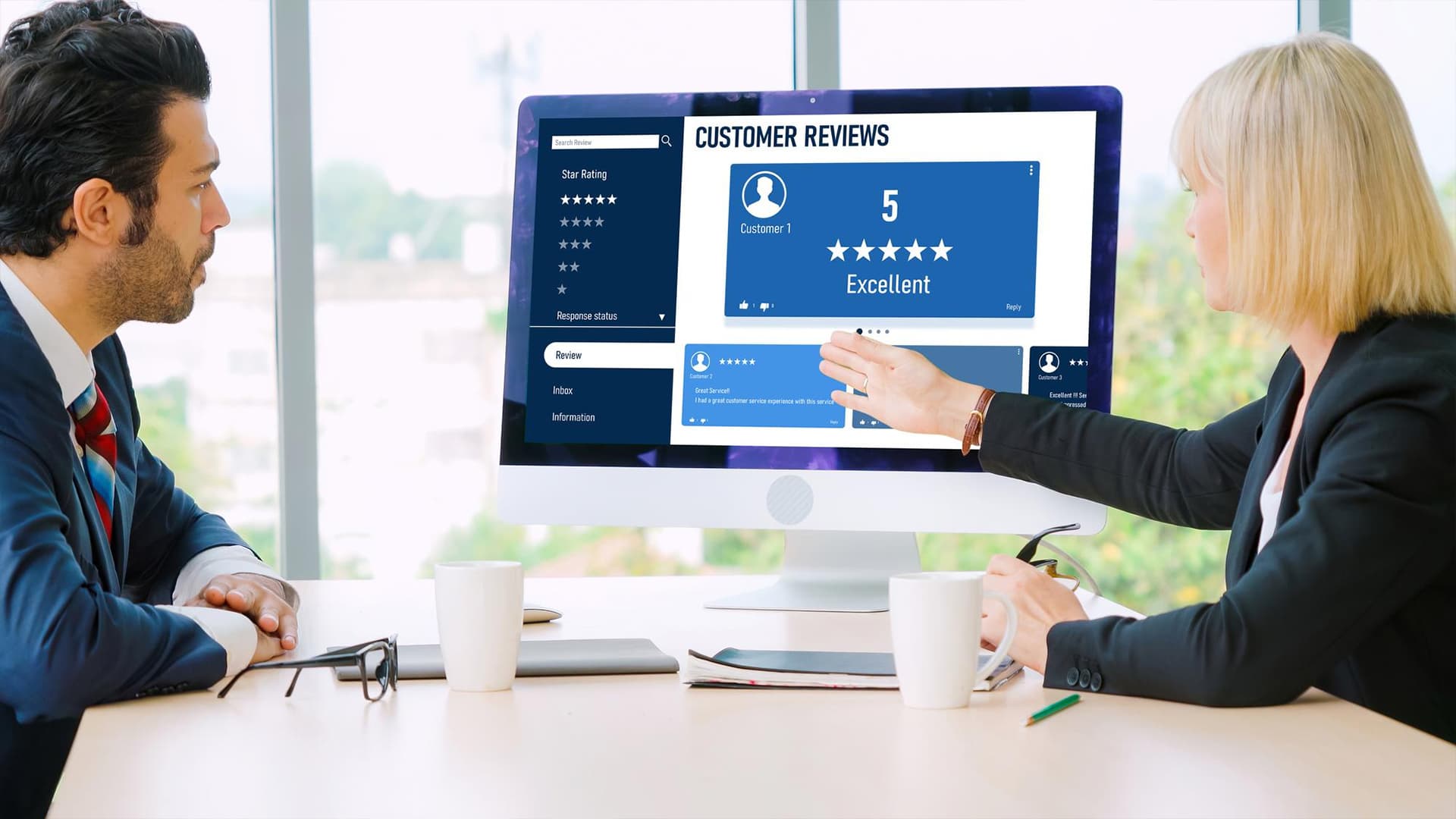
A Lead Is Often Lost Before the Form
Many businesses assume the lead is lost at the contact form.
The visitor did not submit.
The visitor did not book a call.
The visitor did not request a quote.
So the form gets blamed.
But often, the problem started earlier.
The button was not clear enough. The CTA appeared too soon. The page did not explain enough before asking for action. The visitor was interested but not ready. The copy did not communicate what would happen next. The form felt like too much effort. The CTA looked like an ad instead of a helpful next step.
Lead generation is not one moment. It is a sequence.
A visitor first needs to understand the offer. Then they need to feel that it is relevant. Then they need to trust the business. Then they need to believe that taking action is worth their time. Only after that does the CTA become effective.
If any part of that sequence is weak, the button cannot fix it alone.
This is why call to action design should be planned as part of the full page experience, not treated as a design detail at the end.
What a CTA Is Really Asking the Visitor to Do
A CTA is never just asking for a click.
It is asking for a decision.
When a visitor sees a button that says “Book a Consultation,” they are not only thinking about the button. They are thinking about the effort behind it.
- Will this take too long?
- Will someone start selling aggressively?
- Do I have enough information yet?
- Is this company right for my project?
- What happens after I submit the form?
- Am I ready to share my details?
These questions may not be spoken, but they influence behavior.
That is why effective CTA design has to reduce the emotional cost of taking action. The visitor should feel that clicking the button is safe, useful, and logical.
A weak CTA creates uncertainty.
A strong CTA creates momentum.
For example, “Submit” is technically clear, but emotionally empty. It does not explain what the visitor is submitting or what happens after.
“Send Project Details” is better because it connects the action to the visitor’s intent.
“Book a Free Strategy Call” gives even more context because it explains the type of action and the value of it.
Small wording choices can change how the action feels.
The Three Parts of a CTA That Actually Matter
A call-to-action usually has three working parts: the button, the copy around it, and the placement.
Most websites focus on the button first. That is understandable because the button is visible. But the button alone rarely carries the full conversion.
A CTA works when these three parts support each other.
The Button Creates the Action
The button tells the visitor what to do.
It needs to be visible, readable, and specific. A vague button creates hesitation because the visitor does not know exactly what will happen.
“Learn More” can work in some places, but it is often overused. “Start Your Website Project” is more specific. “View Branding Packages” is clearer. “Schedule a Design Consultation” sets better expectations.
The best button text usually completes this sentence:
“I want to…”
I want to book a call.
I want to get a quote.
I want to view the work.
I want to start my project.
I want to download the guide.
This simple test helps make CTA copy more user-focused.
The Supporting Copy Reduces Doubt
The text around the button gives the visitor a reason to act.
A button placed without context may feel abrupt. Supporting copy helps explain why the action is useful and what the visitor can expect.
For example, a CTA section for a website design agency should not only say:
“Contact Us.”
It could say:
“Share your project goals and our team will help you understand the right website direction, design approach, and next steps.”
That short explanation makes the action feel less vague. It turns the CTA from a demand into guidance.
The Placement Decides the Timing
Even the best CTA copy can fail if it appears at the wrong moment.
A CTA placed too early may feel pushy. A CTA placed too late may be missed. A CTA hidden in the footer may only convert visitors who were already determined to contact the business.
Good placement matches the visitor’s stage of understanding.
- At the top of the page, the CTA should support quick action for ready visitors.
- After a service explanation, it should help interested visitors move forward.
- After proof or case studies, it should catch visitors who now feel more confident.
- Near the end, it should give a final clear next step.
Placement is not about repeating the same button everywhere. It is about making the next step available at the moments when the visitor is most likely to need it.
Button Design Is Not About Being Loud
There is a common belief that a CTA button should always be bold, bright, and impossible to miss.
Visibility matters, but loudness is not the same as effectiveness.
A button should stand out clearly from the rest of the design, but it should still feel like part of the brand. If it looks too aggressive, too random, or disconnected from the website’s visual system, it can create friction.
Good button design depends on contrast, spacing, size, shape, and hierarchy.
The visitor should immediately understand which action is primary. If every button looks equally important, the page loses direction. If the CTA blends too much into the background, it loses attention. If it looks like a banner ad, some users may ignore it.
A well-designed button feels obvious without shouting.
This is where strong website development services and user interface design work together. The CTA has to be designed visually, but it also has to work properly across screen sizes, browsers, and devices. A button that looks perfect on desktop but feels cramped on mobile can reduce conversions.
In practical terms, the button should be easy to tap, easy to read, and visually connected to the page’s main goal.
That is the basic foundation of call to action design.
The Copy Around the Button Often Does More Selling Than the Button Itself
A CTA button may be short, but the surrounding copy carries the persuasion.
This is especially true for service businesses, where visitors are not making a simple product purchase. They may be considering a website redesign, a new brand identity, a mobile app, or a marketing campaign. These decisions involve money, time, trust, and uncertainty.
A button alone cannot answer those concerns.
The CTA copy should give the visitor a reason to act now without sounding desperate.
For example:
Weak CTA section:
“Ready to get started? Contact us today.”
Stronger CTA section:
“Have a website idea, redesign plan, or brand project in mind? Share a few details and our team will help you understand the best next step.”
The stronger version feels more useful because it meets the visitor where they are. It does not assume they are fully ready to buy. It gives them a lower-pressure path into the conversation.
For lead generation, this matters.
Not every visitor is ready to become a customer immediately. Some are comparing agencies. Some are still defining the project. Some need internal approval. Some are trying to understand what they actually need.
CTA copy should respect that reality.
Instead of forcing urgency, it should create confidence.
How CTA Placement Changes Visitor Behavior
CTA placement is one of the most misunderstood parts of website design.
Many websites place a button in the hero section and another at the bottom, then assume the page is ready. But visitor behavior is more complex than that.
Different visitors make decisions at different points.
A warm lead may click the first CTA because they already trust the business or came through a referral. A colder visitor may need to read services, view work, understand the process, and see proof before taking action.
That means CTA placement should support both types of visitors.
Early Placement for Ready Visitors
The top CTA is useful for people who already know what they want. They may have searched for the service directly, clicked from an ad, or returned after visiting before.
For them, hiding the CTA creates unnecessary friction.
Mid-Page Placement After Value Is Explained
A CTA after a service explanation can work well because the visitor has just learned what the company offers. At this point, the action feels more connected to the content.
For example, after explaining website design services, a CTA like “Discuss Your Website Project” feels natural.
Placement After Proof
A CTA placed after testimonials, case studies, or portfolio examples can be powerful because proof reduces doubt. The visitor has seen evidence, so the action feels safer.
Final Placement for Decision Support
The final CTA should not feel like a desperate last push. It should feel like a helpful conclusion.
It should remind the visitor what to do next and make the action simple.
The real goal is not to flood the page with buttons. The goal is to align CTAs with the visitor’s decision journey.
The Wrong CTA Can Attract the Wrong Lead
A CTA does more than increase clicks. It shapes the type of leads a business receives.
If a CTA says “Get a Free Quote,” it may attract people who are mostly comparing prices. That can be useful, but it may also bring low-intent leads if the business sells strategy-heavy services.
If a CTA says “Book a Brand Strategy Call,” it may attract visitors who are more serious about the process.
If a CTA says “Start Your Website Project,” it suggests action and readiness.
If a CTA says “Explore Our Work,” it supports visitors who need more confidence before contacting.
The language of the CTA filters intent.
That is why businesses should not copy CTA wording blindly from competitors. The right CTA depends on the service, audience, buying stage, and business model.
For example, a company offering logo design services may use a CTA like “Create Your Brand Identity” or “Discuss Your Logo Design.” A company offering mobile app development may use “Plan Your App Build” because the project requires more discovery and technical planning.
The CTA should match the level of commitment the visitor is ready to make.
A simple product page can ask for a purchase. A complex service page should often invite a conversation.
A Small Scenario: Same Website, Different CTA Strategy
Imagine a business website that gets decent traffic but very few inquiries.
The homepage has a clean design and the services are clearly listed. The CTA button says “Contact Us” and appears in the header, hero section, and footer.
At first, the problem looks like a traffic quality issue. But after reviewing the page, the issue becomes clearer.
The CTA is too generic.
“Contact Us” does not explain why the visitor should contact the company or what happens after. It also appears before the website gives enough context. The visitor may like the page but still not feel ready.
Now imagine the CTA strategy changes.
- The hero button becomes “Discuss Your Website Project.”
- The CTA after services becomes “Find the Right Design Direction.”
- The CTA after portfolio work becomes “Talk to Us About a Similar Project.”
- The final CTA becomes “Share Your Project Details.”
The website is not asking for random contact anymore. It is guiding the visitor through specific next steps.
That is the difference between placing buttons and designing calls-to-action.
The first approach adds clickable elements. The second approach supports user intent.
CTA Design for Service Businesses Is Different From E-Commerce
E-commerce CTAs are usually direct because the action is clear.
Add to Cart.
Buy Now.
Checkout.
Choose Size.
Service business CTAs are more nuanced.
A visitor considering a website, logo, branding project, marketing campaign, or mobile app is not making a quick cart decision. They are evaluating fit, trust, expertise, budget, timeline, and communication style.
That means the CTA should not always push for immediate commitment.
For TCU’s type of audience, a CTA should often invite a useful conversation.
Examples include:
- “Talk to a Website Strategist”
- “Plan Your Brand Identity”
- “Discuss Your App Idea”
- “Request a Design Consultation”
- “Share Your Project Goals”
These CTAs feel more aligned with professional services because they acknowledge that the project needs discussion.
This approach is also better for lead quality. A visitor who understands the next step is more likely to submit relevant details. That helps the agency respond with more useful guidance.
A CTA should never be an afterthought placed at the end of a design project.
It should be planned with the page structure, brand voice, user journey, and conversion goal from the beginning. The button, copy, placement, and form experience all need to work together.
Contact TCU for help with website development services, branding services, logo design services, and digital marketing services that turn website attention into better-quality leads.
The right CTA does not simply ask for action. It helps the visitor feel ready to take it.
The Form After the CTA Matters Too
A CTA click is not the final conversion. It is the beginning of the final step.
If the visitor clicks a button and lands on a confusing form, the lead can still be lost.
The form should continue the promise of the CTA.
If the button says “Book a Consultation,” the next screen should clearly show consultation details, available times, or what the visitor needs to provide. If the button says “Request a Quote,” the form should ask for project information that helps create a quote. If the button says “Discuss Your App Idea,” the form should invite relevant details about the app, audience, features, and goals.
The form should not feel disconnected from the CTA.
It should also avoid asking for unnecessary information too early. A form that asks for too many fields can make the visitor pause, especially if they are still exploring.
For service businesses, the form should collect enough context to start a useful conversation without making the process feel heavy.
A good form feels like a guided step, not an interrogation.
How to Know If Your CTA Design Is Working
A good CTA strategy should be measured by more than button clicks.
Clicks matter, but they do not tell the full story. A CTA may get many clicks but poor-quality leads. Another CTA may get fewer clicks but better inquiries.
Businesses should look at the full lead journey.
- Are visitors clicking the CTA?
- Are they completing the form?
- Are the leads relevant?
- Are people dropping off after clicking?
- Are certain CTAs performing better than others?
- Are mobile visitors converting?
- Are paid campaign visitors taking the expected action?
- Are people engaging with proof before clicking?
These questions help businesses understand whether the CTA is doing its job.
Sometimes the issue is button visibility. Sometimes it is copy. Sometimes it is placement. Sometimes the CTA is fine, but the page has not built enough trust before asking for action.
Testing can help, but testing should be thoughtful. Changing button colors randomly is not strategy. A better test might compare different CTA intent levels, such as “Get a Quote” versus “Discuss Your Project,” or different placements after service details versus after portfolio proof.
Call to action design improves when decisions are based on user behavior, not guesses.
Good CTA Design Feels Like Guidance, Not Pressure
The best CTAs do not feel like traps.
They feel like the natural next step.
That is the difference between conversion-focused design and aggressive design. A good CTA respects the visitor’s stage of awareness. It does not force urgency where none exists. It does not hide information. It does not make promises the business cannot support.
It simply helps the visitor move forward when they are ready.
For a website, this can mean giving visitors different types of actions depending on where they are in the journey. Someone ready to start may need “Book a Consultation.” Someone still researching may need “View Our Work.” Someone comparing services may need “Explore Website Development.” Someone considering a brand refresh may need “Discuss Your Brand Direction.”
Each CTA gives direction without pressure.
This is the real purpose of call to action design. It turns interest into movement by making the next step clear, relevant, and easy to trust.
Final Thoughts!
A CTA is small, but its impact is not.
It connects design, copy, psychology, branding, user experience, and business goals. When it works well, the website feels easier to act on. When it fails, visitors may leave even if they liked what they saw.
Strong CTA design answers three important questions for the visitor:
What should I do next?
Why should I do it?
What will happen after I click?
If the website answers those questions clearly, the visitor feels more comfortable taking action.
And that is how better leads are created.
Not through louder buttons. Not through pushy copy. Not through placing “Contact Us” everywhere.
Better leads come from a website experience that understands the visitor’s decision process and designs the CTA around it.
Frequently Asked Questions
What is call to action design?
Call to action design is the process of designing the button, copy, placement, and surrounding experience that encourages visitors to take a specific action, such as booking a call, requesting a quote, viewing a portfolio, or submitting a form.
Why is CTA design important for lead generation?
CTA design is important because it helps turn website visitors into leads. A clear and well-placed CTA reduces hesitation, explains the next step, and makes it easier for interested visitors to contact the business.
What makes a CTA button effective?
An effective CTA button is visible, specific, easy to understand, and aligned with the visitor’s intent. It should clearly explain the action, such as “Book a Consultation,” “Request a Quote,” or “Discuss Your Website Project.”
Where should CTAs be placed on a website?
CTAs should be placed at natural decision points, such as the hero section, after service explanations, after testimonials or portfolio proof, and near the end of the page. Placement should match the visitor’s readiness to act.
Is “Contact Us” a good CTA?
“Contact Us” can work, but it is often too generic. More specific CTAs like “Discuss Your Project,” “Request a Website Quote,” or “Book a Design Consultation” usually create clearer expectations.
How can CTA design improve lead quality?
CTA design can improve lead quality by using copy that matches the service, audience, and level of intent. A strategic CTA attracts visitors who understand the next step and are more likely to submit relevant project details.
